
Shippo Case Study
Merchant Order Management
The goal of the Shippo is to become the shipping layer of the internet. Many e-commerce merchants struggle in fulfilling their online orders cheaply and efficiently, and Shippo needed to be the one-stop to visualize, organize, and fulfill many orders with as little clicks as possible, for any type of small-business.
I led product design strategy for mid-sized e-commerce companies, streamlining inconsistent workflows to one global label purchase flow, and seamlessly integrating live pricing as users enter shipment dimensions and weight, resulting in $80K revenue increase from consolidated traffic, improved bulk purchase adoption and user satisfaction by 5% and net promoter score +9.
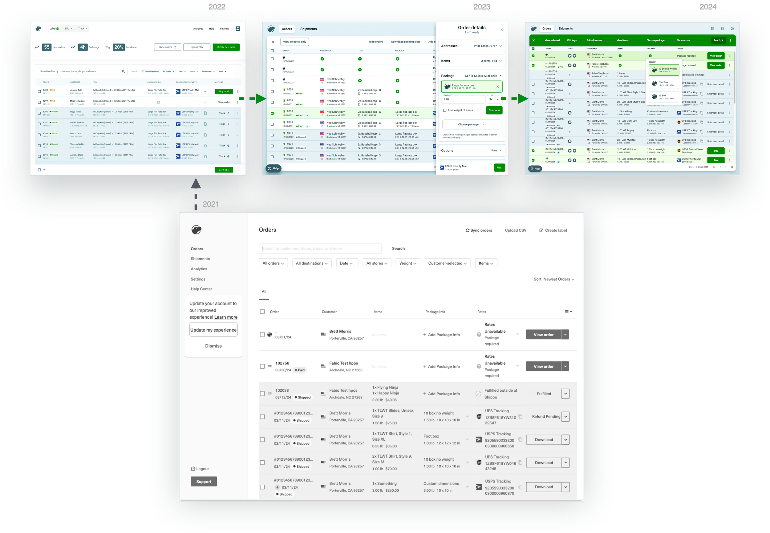

Field research participant 1

Field research participant 2
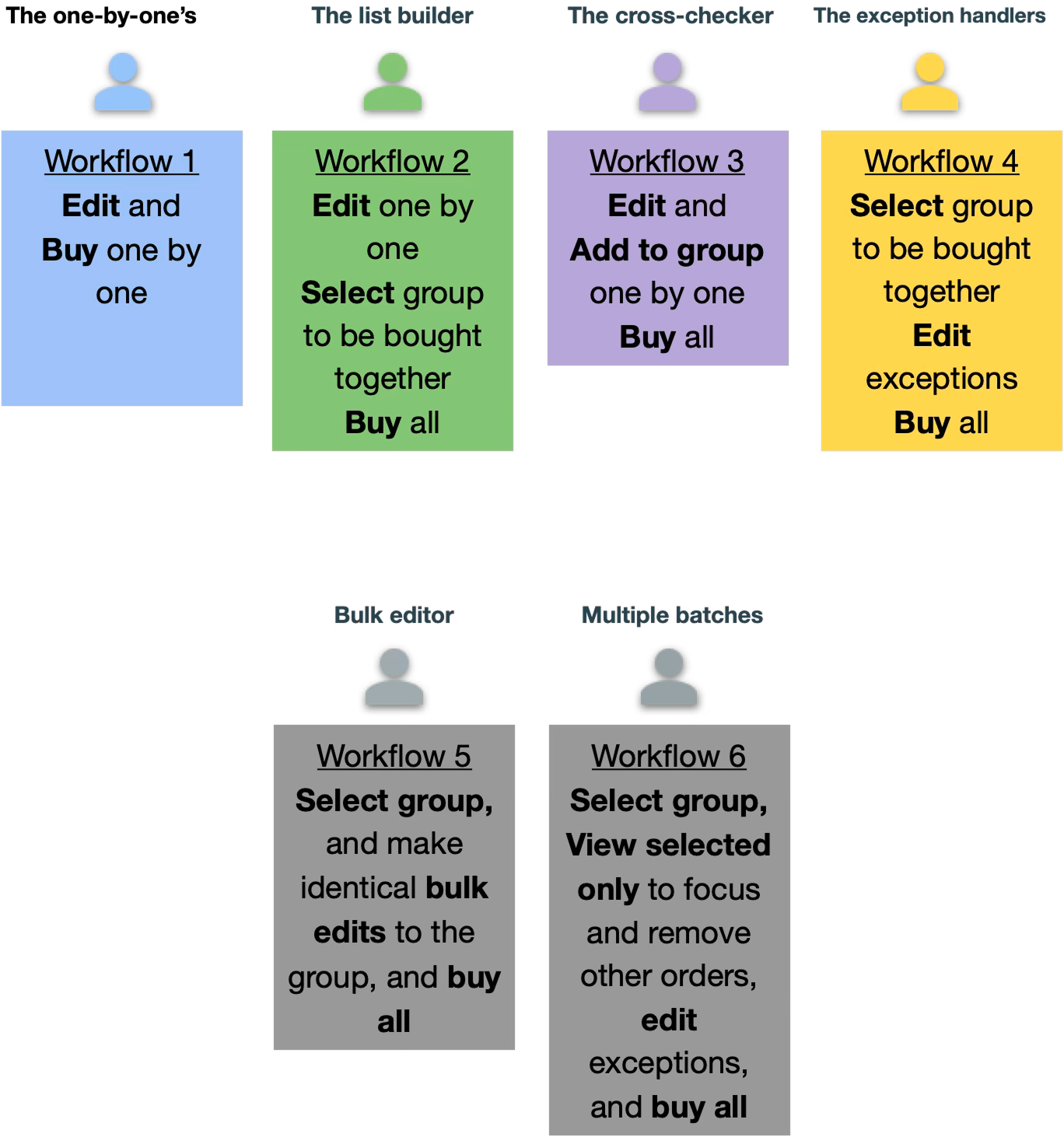
High volume customer stratification by workflow

Field research participant 3

Shippo had problems with their main label purchase workflows that were redundant, inaccessible, and cumbersome to use as shipping volume grew, which frustrated high-volume Shippo customers, and wasn’t aligned to the overall Shippo mission to be the shipping solution for any size merchant.
Problems:
Order list was mixed with multiple states
Multiple inconsistent ways to buy a label
Slow down of label purchase with irrelevant information display as number of labels purchased grew
Limited mobile access, and inconsistent workflows in different screen sizes
I created a service blueprint mapping services to needs of the merchant, scaled from a one-person to full-service fulfillment teams. I established 6 workflow styles across business sizes that was based on aggregate label purchase traffic, and tested iterations that could accommodate all styles while reducing the number of clicks to purchase.
I created a single modular, extensible label purchase flow and bulk purchase mechanisms that was consistent for single, bulk, automated, and embedded label purchase workflows.

Consolidation and reduction of business flows to one responsive, modular pattern that progressively provides useful details with increased screen real estate

First-click testing to understand differences of low and high volume shippers.
I launched a global design system with reusable components in Figma, establishing standards to boost accessibility across touchscreen and desktop keyboard controls, increasing design production efficiency by 50%.

Molecule example, constructed with reusable buttons and forms

Organisms example, taking lower level molecules and arranging them to cover all business flows
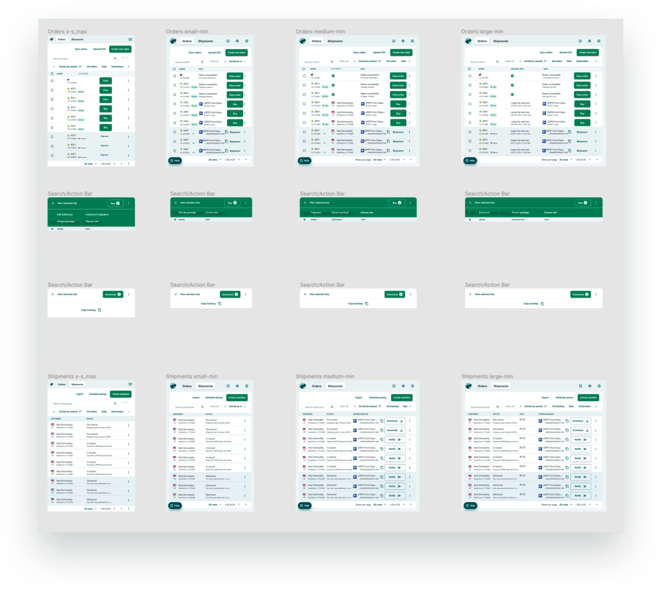
Updates to accommodate bulk flows to all viewports.

Specification of breakpoints utilizing the same organisms and molecules to ensure parity of features in all screen sizes